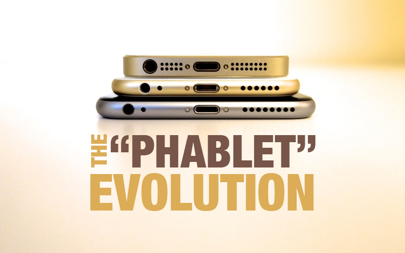
The “Phablet” Evolution
Remember the time when smaller mobile phones were fancy and had small screens?
Well that time has gone!
A smartphone having a screen which is standard in size between that of a smartphone and a tablet computer. The word itself speaks: phone + tablet = phablet. So these are mobile phones that are way bigger. More specifically, the screen size of these devices typically extends between 5 inches to 6.9 inches.
In the last ten years, smartphones have changed their shape, size and design. Since Apple changed the “evolution” of the mobile phone with the iPhone release, smartphones have grown rapidly and are followed behind large screen phones “Phablets” that have expanded its market presence rapidly. We can say that screen sizes have been an issue for quite a while before the iPhone with phone manufacturers producing phones with bigger screen sizes are compressed into small Containers since 2001.
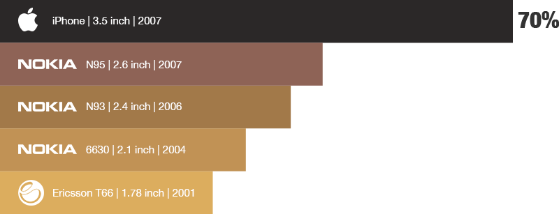
Apple and Samsung had realized that bringing evolution into smartphone has increased the attention of consumers. This has been proven in the past between 2001 to 2007. Companies like Ericsson and Nokia have proven to be more consistent with screen sizes every year starting from 1.7 inch to 2.1 inch, 2.4 inch & 2.6 inch which was a difference of 10%, 20% in size, whereas Apple’s original iPhone in 2007 had screen size of 3.5 inches which did not differ by 10% or 20% but by a huge 70%.
In 2011 Samsung had introduced Galaxy Note and changed the specifications of screen size by introducing the phablet with a 5.3 inch screen and creating a huge margin by 85% between the iphone 4, 4s and Galaxy s which were considered to have a larger screen size.

Now mobile manufacturers have started to produce 6-inch phones. Apple has upgraded their iPhone series in 2014 into the smartphone market with 5.5-inch iPhone plus models, Samsung with its 5.7 inch Galaxy Note models and now Google with its pixel XL 5.5-inch phone.
It may be too early to tell, but the market seems to have stalled. It seems like the ‘large’ screen optimal size is about 5.5 – 5.9 inch that goes like the Galaxy Note and iPhone Plus.
So what does the rise of the phablet mean for designers?
Essentially, the biggest factor in terms of UI design is the size of screens. Whereas the small sized smartphone has a screen size of 3.5 inches, phablets can reach up to 6.9 inches, a reasonable double of the interface space. It’s fine for the tablet, which is crafted for two-handed use, but what about the phablet?
The greatest impact, in terms of user experience, is mainly on thumbs. You may have heard the term “Thumb Zone” it means the area across which a human thumb can move comfortably while holding a mobile device.
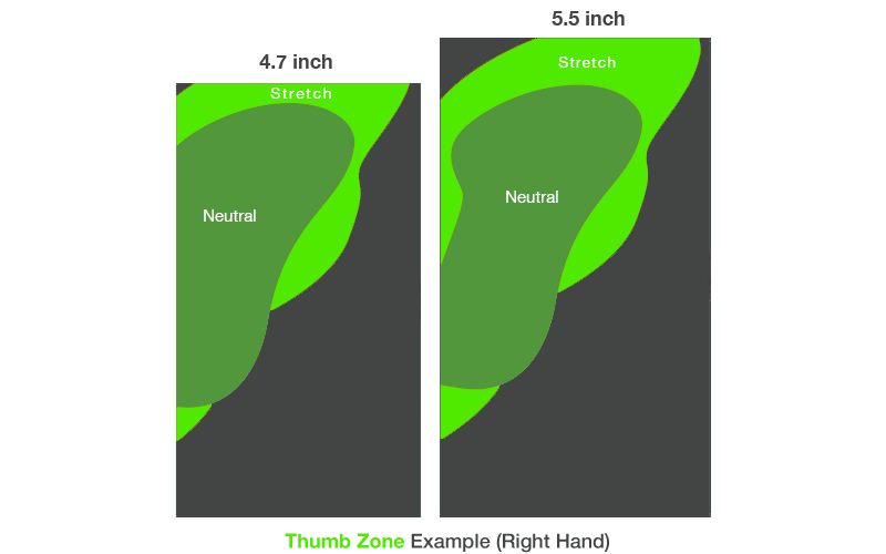
This rule in UX is crucial to remember when designing applications or responsive websites while phablets are capable for both two-handed and one-handed use. On a big screen, it is hard to get your thumb to stretch on the furthest parts of the phone. For this finding, smart UI design is a key to improving the user experience of phablets.
Let’s check out few key things when designing for larger mobile screens.
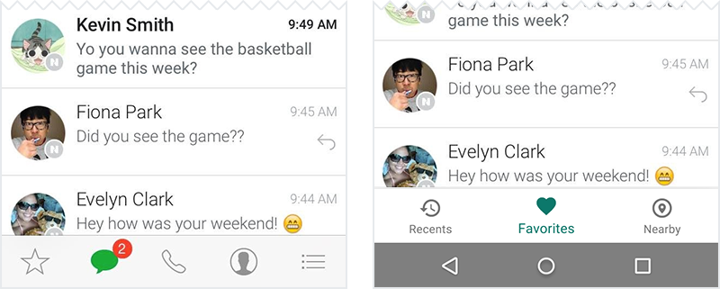
Bottom Navigation
Let’s say that there are 10 million users using a social app worldwide and let’s assume that 20% of these users are accessing the app on a phablet, That’s almost 100 thousand users. On the first version the users have to stretch their thumb to the hamburger icon where they have to tap to navigate other screens, which was feasible but then the users can change the way they hold the phone, users don’t mind that. But does that show a good user experience? Short answer no, it does not.
This is where bottom navigation comes in. We can move the hamburger menu from the top to the bottom of the screen. Placing their most frequently used interactions within easy thumb reach instead of placing it up top. The best way to test the experience is when you’re in the prototyping stage of your design process.
Floating Action Buttons
When design for android, most android devices have bottom-anchored system navigation which is tangling with your bottom navigation plans, leading to mis-taps and user frustration but for that issue there is a solution. Google allows designers to promote the action in a floating button, it allows a designer to use floating action button as a powerful call to action for the user; They provide an opportunity to direct user flows and streamline your interface. They stand-out visually and guides the user to perform the most popular, common action on that particular screen.
Responsive Patterns
When designing responsive websites, all screen sizes matter where images get smaller and texts get smaller. When looking at the overall design noticing action buttons in a responsive format, responsive website designers in Washington sometimes cannot be reachable to the user on a big screen.
For this, the solution is to have action buttons in the center of the page, where it is more reachable to the user on phablets. This helps the user to make a more accurate tap on the screen.
For key navigation, it is ideal to make a hamburger menu where it is possible to reach and tap, but when doing so making users tap on the hamburger icon the navigation buttons should be aligned in the center of the screen for easy access.
Bigger screens, UI tweaks, UX gains.
Overall, the challenges present when designing for larger screens provides designers with some interesting opportunities. Prototyping will become more important. Phablets are definitely shaping the way we consume digital content, impacting the way we design for mobile.The real challenge for UI/UX designers is to enhance all the best of the phablet in the most common and least awkward way of interaction.
Recent Posts
Deep Learning Explained: Understanding the Brain Behind AI
The Intersection of AI and IoT: Creating Smarter, Connected Environments
The Evolution of AI: From Simple Algorithms to Neural Networks
The Role of AI in Sustainable Development
Scaling New Heights: Integrating Advanced Technologies in Startup Product Engineering